
Last week, I looked at the history of the Fischer Family Trust the cuddly titled money making machine founded by Mike Fischer of RM plc. As I said, the ‘family’ and ‘trust’ imply something quite friendly about the FFT, and I prefer to think of the FFT as the FFS, with – presumably – well paid statisticians who push their clearly addictive nonsense in to schools, who appear to know no better and end up trusting the ‘experts’. This week I’m going to look at the kind of thing the FFS actually produces to further the Data Driven Disaster afflicting English schools.
Before getting onto the nitty gritty, it’s worth pointing out that RAISEonline is processed and managed by RM plc of Milton Park, Abingdon, and FFT estimates are processed and managed by FFT Education, of Milton Park, Abingdon. It surprised me when I found out that the two were so closely linked, and it may surprise those who work in schools quite how close these past masters at extracting money from gullible governments are.
Much of the FFT/Fischer Family Trust/Evil Empire data is hidden away from view of the general public, since, you know, the data relates to actual children (although you can buy that should you want to), but of late their ‘Governor Dashboard’ has drifted into view as part of the RMFFT FFTLive subsidiary. You can find examples of what it tells you about schools in corners of the interweb, and it’s worth having a look to see what alchemy is being presented to school governors at taxpayers' expense.
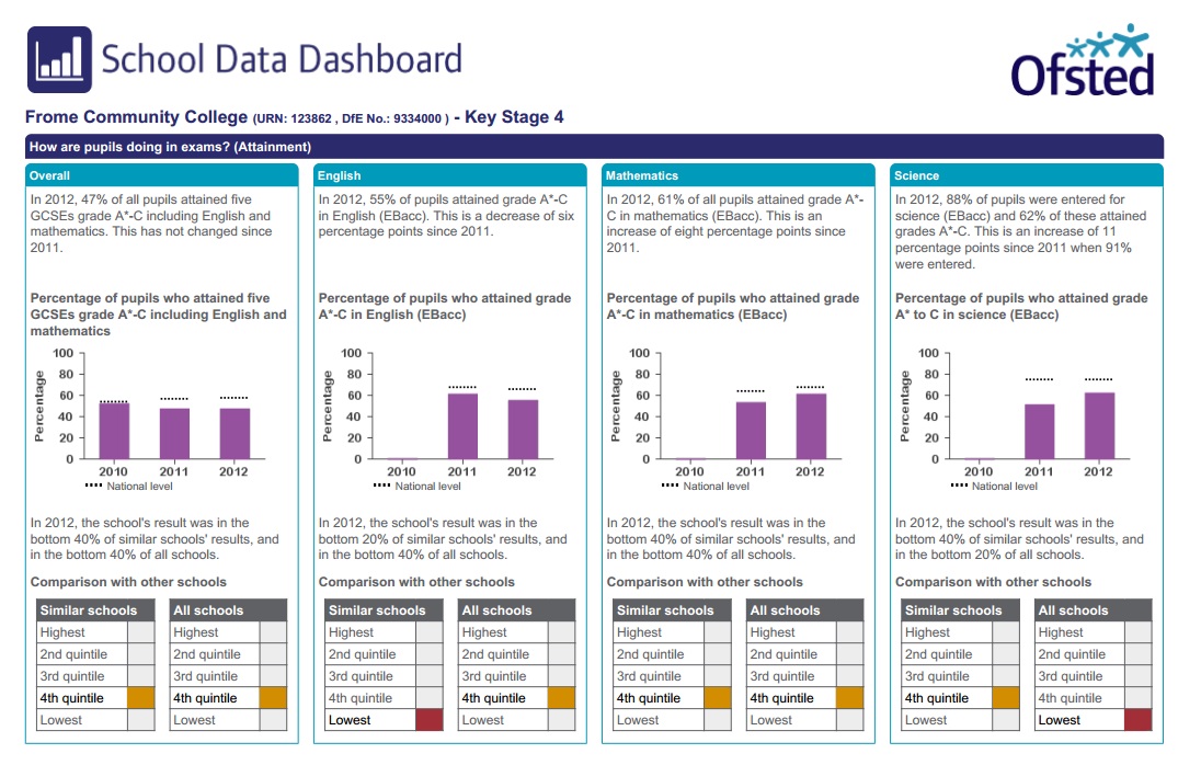
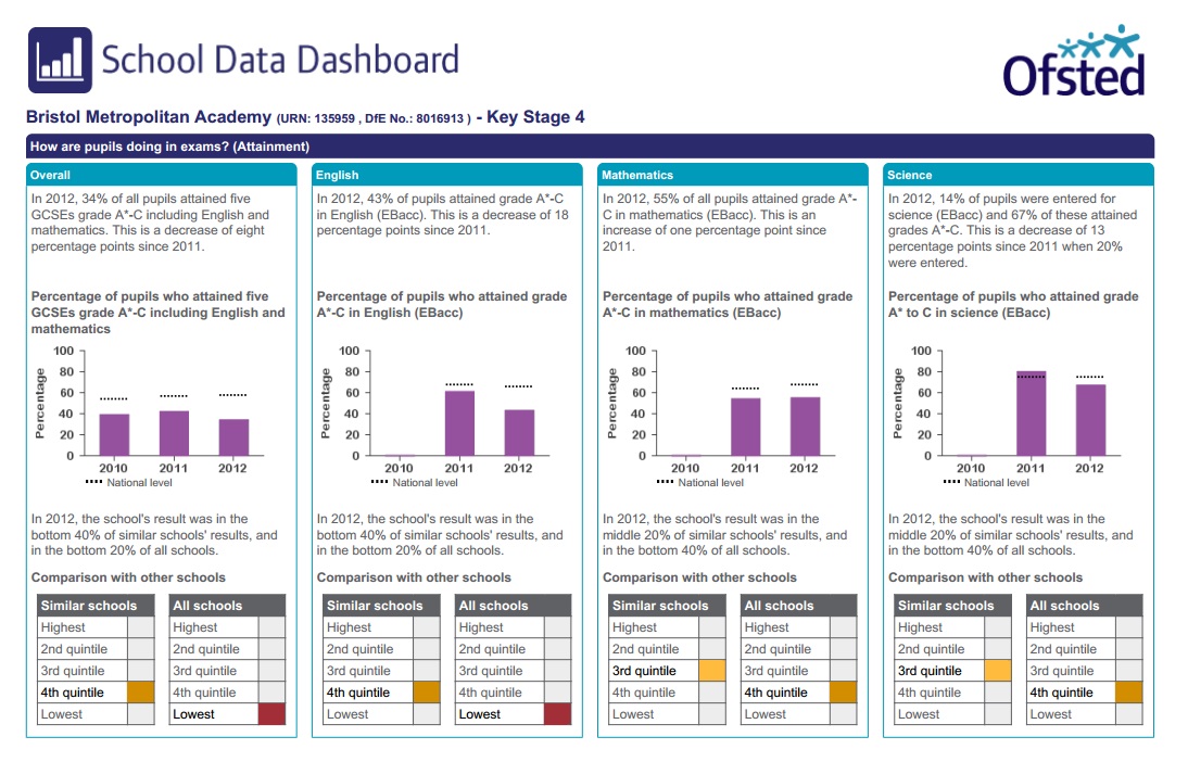
So, let’s have a look at a dashboard, in the first instance for a primary school. This is page 1 of a four page document:
Before getting onto the nitty gritty, it’s worth pointing out that RAISEonline is processed and managed by RM plc of Milton Park, Abingdon, and FFT estimates are processed and managed by FFT Education, of Milton Park, Abingdon. It surprised me when I found out that the two were so closely linked, and it may surprise those who work in schools quite how close these past masters at extracting money from gullible governments are.
Much of the FFT/Fischer Family Trust/Evil Empire data is hidden away from view of the general public, since, you know, the data relates to actual children (although you can buy that should you want to), but of late their ‘Governor Dashboard’ has drifted into view as part of the RMFFT FFTLive subsidiary. You can find examples of what it tells you about schools in corners of the interweb, and it’s worth having a look to see what alchemy is being presented to school governors at taxpayers' expense.
So, let’s have a look at a dashboard, in the first instance for a primary school. This is page 1 of a four page document:

Firstly, it’s worth noting that the dashboard is strikingly similar to the OFSTED Schools Data Dashboard, with a similar claim that the dashboard can be used to answer six key questions:
1. How does attainment and pupil progress compare to the national average?
2. How are we performing in different subjects?
3. Do we have any under-performing pupils?
4. How might the context of our school affect our performance?
5. How does pupil attendance compare to the national average?
6. What are the strengths and weaknesses of our school?
As always, the dashboard can’t actually answer these questions in any meaningful way, but it pretends it can. The guidance for governors section is hilarious, if you read it with so much as a half-cocked eyebrow of scepticism. I particularly like the ‘small pupil cohorts’ disclaimer, which suggests that data is suppressed for small pupil cohorts; this follows a ‘strengths and weaknesses’ explanation which says that two children is a reasonably sized cohort for analysis.
The ‘statistical significance’ explanation is almost the same as the OSDD/RAISE interpretation of this key statistical concept, and equally as flawed as far as I can see. Not that I can say anything about the methodology as the Governor Dashboard comes with no supporting notes of any use whatsoever, again as far as I can tell.
The data is drawn from here and there, including the National Pupil Database although the GD doesn’t mention that, as it happens, all of this data is collected, processed and managed by… the FFT. The page I have linked to also confirms the close links between RM and FFT, who work ‘in partnership’. Yes, it is indeed the RMFFT show.
If you do want to know how the Governor's Dashboard data is crunched, you are referred to www.fft.org.uk, a website which contains no information whatsoever about the methodology behind the data wizardry used in the dashboard.
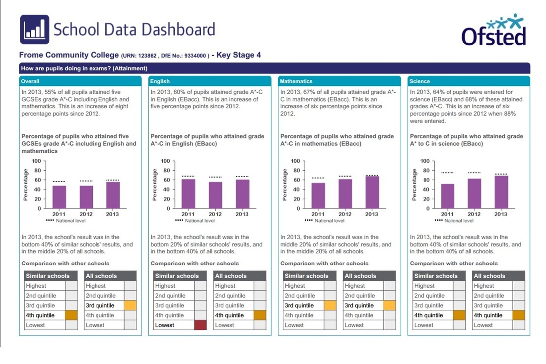
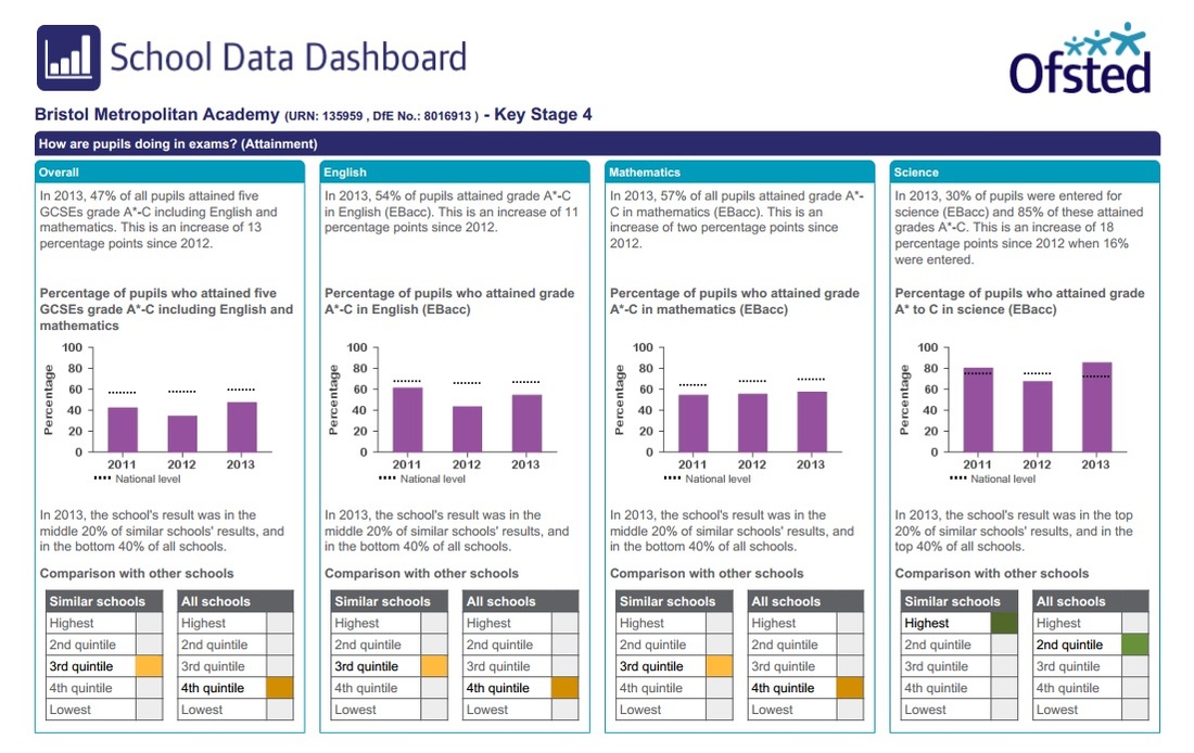
Page 2 of the dashboard is a real treat for fans of oversimplified Not Even Wrong data:
1. How does attainment and pupil progress compare to the national average?
2. How are we performing in different subjects?
3. Do we have any under-performing pupils?
4. How might the context of our school affect our performance?
5. How does pupil attendance compare to the national average?
6. What are the strengths and weaknesses of our school?
As always, the dashboard can’t actually answer these questions in any meaningful way, but it pretends it can. The guidance for governors section is hilarious, if you read it with so much as a half-cocked eyebrow of scepticism. I particularly like the ‘small pupil cohorts’ disclaimer, which suggests that data is suppressed for small pupil cohorts; this follows a ‘strengths and weaknesses’ explanation which says that two children is a reasonably sized cohort for analysis.
The ‘statistical significance’ explanation is almost the same as the OSDD/RAISE interpretation of this key statistical concept, and equally as flawed as far as I can see. Not that I can say anything about the methodology as the Governor Dashboard comes with no supporting notes of any use whatsoever, again as far as I can tell.
The data is drawn from here and there, including the National Pupil Database although the GD doesn’t mention that, as it happens, all of this data is collected, processed and managed by… the FFT. The page I have linked to also confirms the close links between RM and FFT, who work ‘in partnership’. Yes, it is indeed the RMFFT show.
If you do want to know how the Governor's Dashboard data is crunched, you are referred to www.fft.org.uk, a website which contains no information whatsoever about the methodology behind the data wizardry used in the dashboard.
Page 2 of the dashboard is a real treat for fans of oversimplified Not Even Wrong data:
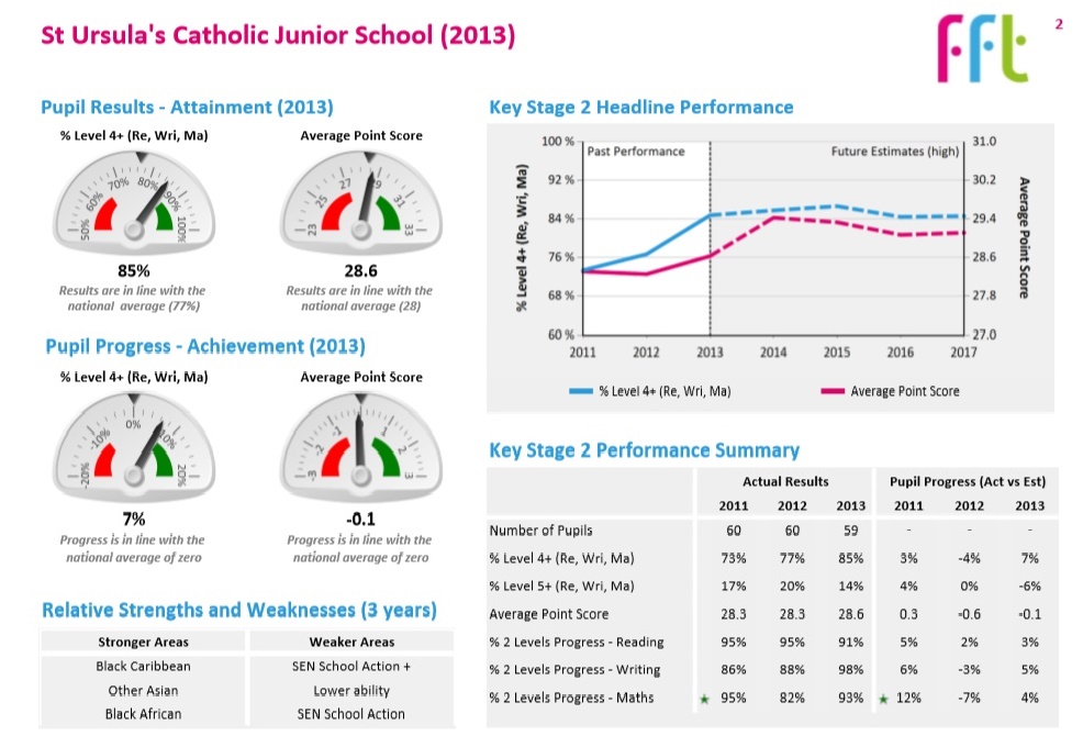
Where to start? The cutesy ‘speed gauges’ are designed for Top gear fans. The ‘Key Stage 2 Headline Performance graph’ contains guesses for the next four years. The ‘Relative Strengths and Weakness’ are based on spectacularly small groups of children. And the ‘Key Stage 2 Performance Summary’ suggests that assessments of small numbers of highly individual children can be lumped together, put into a data mixer and percentages and means can be spewed out to show some kind of ‘trend.’
All of these things are daft, but the last is particularly irritating. Data for any school would show you why, but here we finally have data for more than two years (something I have complained that the Ofsted Schools Data Dashboard and Performance Tables do not show you). We only get three years, which is still irritating since children are in primary schools for seven years, and that’s the minimum amount of data I’d like to see in this kind of table, and three years doesn't give you a proper chance to see how silly it is to infer any kind of 'trend' in grouped data of this kind.
The data shows you, of course, that the means are random. If you understand modelling based on CLT, you might think, well, duh! They have to be randomly distributed, because that’s how this kind of data is supposed to work - the means are randomly drawn from a population. But you are being asked to view randomly distributed means as if they were somehow indicative of a 'trend', which of course they are not because that makes no statistical sense.
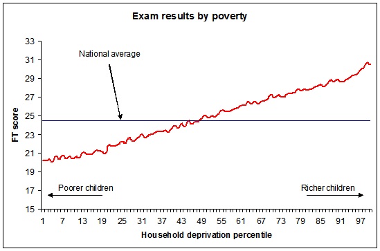
I argue that the means are entirely random because the make up of each class is completely unique, and the numbers in each cohort so small, that the pupil effect drowns out any 'teacher effect' or 'school effect'. The numbers just tell you that each class is randomly different. So what you would expect is that each of these data sets would be entirely random. Which they are, and which is why this data isn’t shown in a graph. If it was, it would look like this:
All of these things are daft, but the last is particularly irritating. Data for any school would show you why, but here we finally have data for more than two years (something I have complained that the Ofsted Schools Data Dashboard and Performance Tables do not show you). We only get three years, which is still irritating since children are in primary schools for seven years, and that’s the minimum amount of data I’d like to see in this kind of table, and three years doesn't give you a proper chance to see how silly it is to infer any kind of 'trend' in grouped data of this kind.
The data shows you, of course, that the means are random. If you understand modelling based on CLT, you might think, well, duh! They have to be randomly distributed, because that’s how this kind of data is supposed to work - the means are randomly drawn from a population. But you are being asked to view randomly distributed means as if they were somehow indicative of a 'trend', which of course they are not because that makes no statistical sense.
I argue that the means are entirely random because the make up of each class is completely unique, and the numbers in each cohort so small, that the pupil effect drowns out any 'teacher effect' or 'school effect'. The numbers just tell you that each class is randomly different. So what you would expect is that each of these data sets would be entirely random. Which they are, and which is why this data isn’t shown in a graph. If it was, it would look like this:
 | 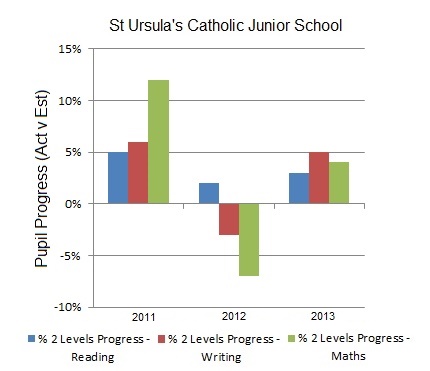 |
The graph on the left is the raw scores of children making two levels of progress over Key Stage 2 ('attainment'), and the other graph is how 'attainment' compares to modeled guesses about 'attainment' ('pupil progress'). And both are randomly distributed, showing you how unique each cohort in this school is, and would show you how unique any cohort in any school is. The year on year changes have little if anything to do with anything that the teacher or school might have done, and everything to do with the children - hi kids! - who were in these cohorts.
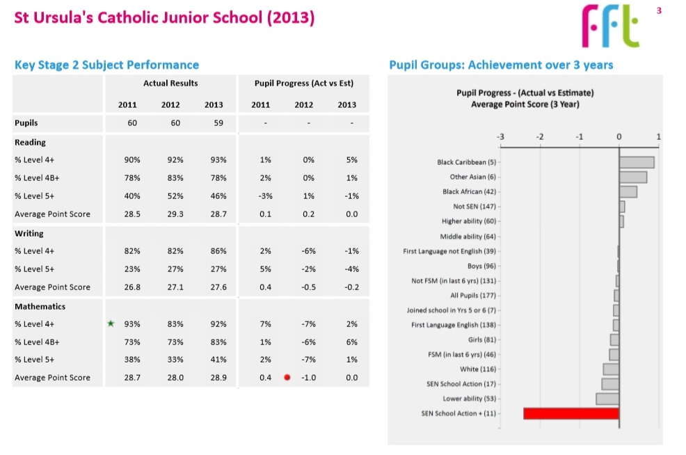
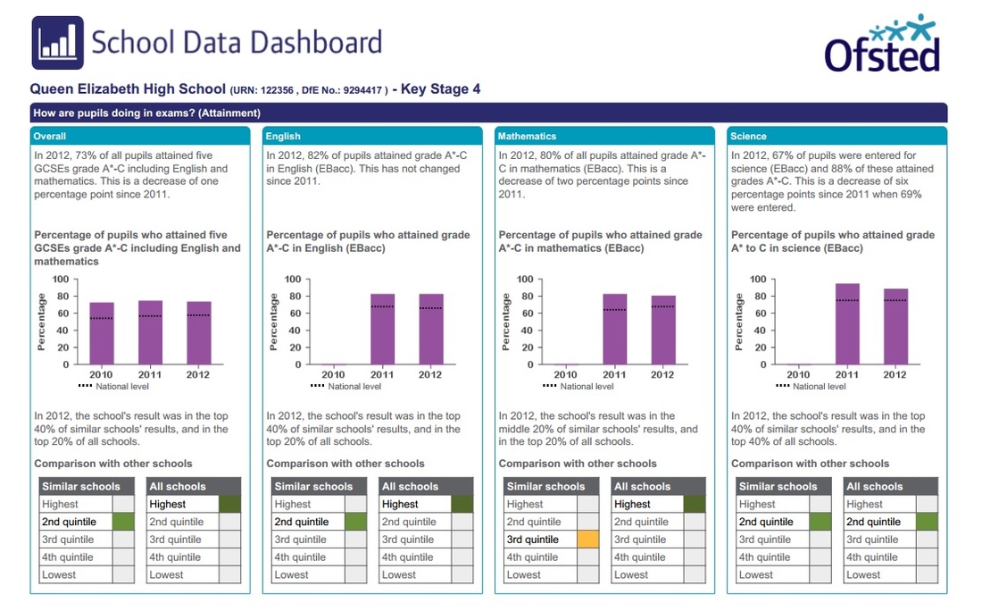
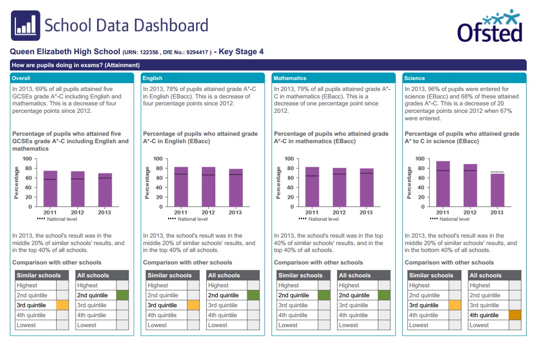
Page 3, above, brings more entertainment as you start to see rows of random datasets for ‘Key Stage Subject performance’. These aren’t presented in graphs because they’d be clearly random, but there is enough there for a non-expert to pick out at least one ‘trend’, which will no doubt be pored over by teachers and their managers, leading to yet more time wasted on DDD which could have been spent actually doing something which would benefit the children in a school, like letting them have a childhood and encouraging them to find school interesting and enjoyable.
There’s also the ‘Pupil groups: Achievement over 3 years’ fiction; fiction because the data is hopelessly compromised, using analysis which is entirely unexplained and almost certainly statistically nonsense. No doubt there is an expensively produced data ‘analysis’ tool available to governors and school managers which allows you to drill down into this data. But given that this school has 60 children per cohort, the numbers are stupidly small and any inferences pointless.
The top three ‘relative strengths and weaknesses’ identified on Page 2 are shown here. The three strengths include two groups with 5 and 6 children and one with 42. Remember that these are over three years, so that’s around 2 children per year in two groups and 12 in the other one. Of the ‘weaknesses’, two groups have 11 and 17 children, around 5 children a year. The other has 53 children (17 a year) who were finding school difficult in Year 2 and - guess what - still did in Year 6.
These numbers are so small, and the data so compromised, that the only thing you can do with this data is look at it, make some general comment and move on. It adds absolutely nothing to your understanding of the school and to pretend otherwise, especially to those who are supposed to hold the leadership to account for their actions, is dishonest.
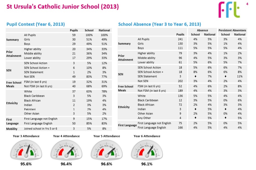
Page 4, above, contains yet more daft data, with a breakdown of the 'Pupil Context' of last latest year 6 cohort. This data is available elsewhere and this is simply selling old rope, as is the entire document. I would hope that a governor would look at this data and realise that it shows just how unique any given cohort is, making generalisations at school level ridiculous. I can at least hope...
The document ends with my favourite data nonsense of the whole pointless exercise. I’ve criticised the ‘achievement’ and ‘progress’ data disaster before, here, here and here. This is the first time I’ve had a proper chance to look at attendance data, which is presented here as ‘School absence'.
Collection and use of this data is beyond ridiculous. Firstly, the data always shows you that most children are in school most of the time. This is because just about all school absence is due to childhood illness, and is authorised by the school as a result. The national absence rate is 5%, which might been seen as surprisingly low given the number of low level illnesses the school population shares around. Nationally, more able children are in school marginally more of the time and less able children are in school marginally less; even here, the numbers are relatively insignificant.
(My own children are given attendance certificates each term, because schools are encouraged/mandated to waste time and effort on attendance. My children either get 100% certificates, or, to their frustration should they have been unfortunate enough to have picked up a bug which has kept them off school, they get certificates in the high 90s. Not once have they asked to go to school when ill so that they keep up their '100% attendance' record, and I wouldn't bat an eyelid when phoning them in sick. I doubt many other parents do either.)
Secondly, this data is collected simply because it can be collected. It’s not actually very useful on any level, because the data simply reflects what class teachers and school staff can see for themselves on the ground. The argument that having data like this helps to build a picture is clearly daft if you can see the picture in front of you. Teachers are much more likely to think, “Hmm, child X keeps missing school, I wonder why? I’ll keep a record, find out what's going on and do something about it”.
Yes, absence is a problem for some families, but not at every school, and even then, not for most children. If we really have given schools autonomy over their day to day affairs, this should be for each school to monitor.
Thirdly, collecting and publishing this data nationally has led to stupid big brother directives made from central government, which now mean that, unless someone has died or the child is ill, children are not allowed any time out of school whatsoever. Unauthorised absence is fined, heavily and indiscriminately (see here for my suggested ways to subvert this stupidity).
(A family with three children taking time out of school to travel around Europe visiting all the major capitals and significant sites of historical interest, in the way my family did when I was ten years old and lived on another continent, would now be fined hundreds of pounds for doing so. Even now, I still remember the trip I took then, and it helped immeasurably in my understanding of the world all through my teens and later life. A family like mine probably wouldn’t do it now.)
Money for old, meaningless, Not Even Wrong rope
Ultimately, the Governor Dashboard is yet another example of expensively produced data driven nonsense, which doesn’t add anything whatsoever to the quality of children’s education in England. Governor’s time will be wasted in even reading this stuff, never mind trying to glean information from its entrails. Any Governor who wanted to know any of this information could simply log on to one of RMFFT’s other expensively produced websites, or, you know,visit the school and arrange to be introduced to the children in each class.
The FFS is making a fortune selling old rope to the 24,372 schools in England. And that rope is threadbare and entirely unfit for purpose, furthering the Data Driven Disaster currently afflicting English schools. RMFFT must be laughing all the way to the bank.
(Here is a copy of the Governor Dashboard for St Ursula's Catholic Junior School. A Secondary Dashboard, with largely the same daft data, can be found here.)


 RSS Feed
