When looking at any DfE-originated education data such as ASP (formerly known, in a slightly different guise - as RAISEonline), it is worth reiterating that ‘Sig’, ‘Sig+’ and ‘Sig-‘ do not mean what readers are led to believe they mean, and thus there is a strong possibility these terms will misdirect or confuse those seeking insight from DfE data.
In this blog, I’m going to look at the way in which Sig +/- is calculated. I’ll also explain why it does not mean what many people might think it does. Given that data is often seen as a sign post, not a direction, it is important that schools know which signposts are wrong, and why.
As things stand, ‘Sig’ is held to indicate something is ‘important’, even though, if it means anything at all, it means that cohorts or groups in a given school are not similar to the wider population of children in schools. This is, at best, trivially true; this is likely to be trivially true even where data is not labelled as ‘Sig, since school cohorts are not randomly distributed across the population.
Data which is markedly different to the national average is clearly of interest, and there better ways to indicate differences between cohort data and national data than misusing statistics based on hypothesis testing. The use of ‘Sig’ needs to come to an end, and those who use DfE-originated education data to signpost lines of enquiry should either dismiss ‘Sig’ and its variants, work to remove it as a signpost, or develop different vocabulary and techniques to indicate unusual data points.
Ofsted, in particular, have made great strides in the past two years in their attempts to increase the understanding of education data amongst inspectors and within schools, and various government reviews have called for better training and data awareness in the schools sector. The guidance for the use of the Inspection Data Summary Reports indicates that the DfE have taken criticisms seriously and made attempts to improve the way in which they present data. This blog has been written to attempt to explain how the concept of ‘statistical significance’ continues to be bastardised in attempts to signpost potential areas to investigate within school data.
Understanding how data gets flagged as ‘Sig +/-‘ is a bit complicated, but anyone who still assumes that ‘Sig’ means what it purports to mean should at the very least be able to follow the process below, and to see the reasons why ‘Sig’ is misleading and unhelpful.
Why does the DfE label data Sig+/Sig-?
In essence, the purpose of Sig+ and Sig- labels is to indicate whether a data point is unusually high or low when compared to national data. The DfE regards datapoints as reflecting the efforts of schools rather than the cohorts within them, and therefore unusually high or low datapoints are held to be likely to be indicative of something about the school.
The guidance for the Inspection Data Summary Reports (ISDR) shows the confusion at the heart of the DfE's use of the word 'significant'. There is a clear difference between 'statistical significance' and everyday 'significance', which is not apparent in this sentence:
'Red borders will indicate where a figure was, statistically, significantly below the national average. Green borders will indicate where a figure was, statistically, significantly above the national average.'
There is further explanation of the way in which ‘areas to investigate’ are generated in the Guidance for the inspection data summary report: areas to investigate, which confirms the misuse of the term significant:‘In 2017, KS2 reading progress was significantly above average and in the highest 10% for all pupils.’ This confirms the way in which the DfE uses the word ‘significantly’ as a synonym for ‘importantly’, which is not justified in any way.
There is yet more confirmation of the confusion in the following sentence, which also confirms that the a '95% confidence level' is being (mis)used:
‘Writing and mathematics progress for SEN support middle prior attainers was significantly* below the national for all pupils over the last two years.’ *statistical significance based on a 95% confidence interval
(Whilst this is frustrating, it is an improvement on previous guidance. Some criticisms have clearly been taken on board, and the DfE tries to deal with outliers and the problem of small groups. Neither really help, but are worth noting:
The Guidance document explains how the DfE defines outliers within data (At KS2 ‘a progress score () 3.25 standard deviations away from the national mean, based on the standard deviations for each prior attainment’) and how it reports their effects on the data. Data which are 3.25 standard deviations from the mean represent 0.12% of the total, making these data extremely rare; as Appendix 2 of the Guidance document makes clear, for most of those with low prior attainment, in most cases it is impossible for data to be flagged as an outlier by the DfE.
The document explains that at Primary level, groups of less than 11 children for single year data are not reported, nor are three-year trends with fewer than 6 pupils per year. It is worth noting that data based on anything less than 30 individuals would be regarded as extremely small by most statisticians, and that the DfE’s criteria asks a great deal of the data it summarizes.)
In summary, use of ‘sig’, with claims of ‘statistical significance based on a 95% confidence interval’, isn’t justified, and misuses a complex area of statistical theory in an effort to indicate whether a given datapoint is unusually high or low compared to national averages.
The simplest way of indicating whether datapoints are unusual would be to report where a data point sits in the national distribution of scores, whilst indicating that there are large degrees of uncertainty in doing this because of measurement error when generating pupil performance data, that outliers have a disproportionate influence on single data points and that the data points reflect cohort effects rather than school effects. It would also be necessary to underline that these issues are magnified when cohort size is small, as is the case for most DfE datapoints.
In this way, a cohort progress score of less than -1.5, in KS2 Reading say, could be labelled as being in the lowest 25% of cohorts nationally (with caveats about unknown measurement error, and cohort-size awareness, which would make it clear that the datapoint comes with an inherent amount of uncertainty).
ASP goes some way towards this when it summarizes schools in the following type of chart:
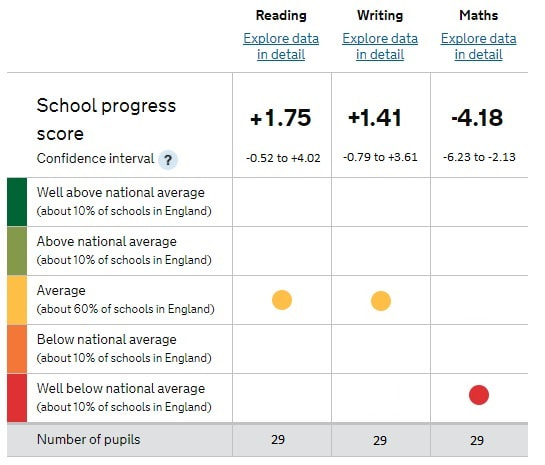
In this summary, cohorts are allocated one of five bands – lowest 10%, next 10%, middle 60%, next 10%, highest 10% - of the national population. Whilst one could quibble with the use of red for ‘bad’ and green for ‘good’, it is useful for all those considering a school’s position to have an indication of outcome relative to national averages. Unfortunately, the chart includes confidence intervals*, which are tests of significance, and suggest certainty where there is none.
The use of significance testing and confidence intervals crept into DfE data largely because the accountability-focused nature of DfE data does not deal well with uncertainty. At some point in what is now the dim and distant past (the late 1990s), schools raised concerns about the confidence with which assumptions were being made about data; somebody introduced the DfE to the concept of significance testing as a misguided way of reducing uncertainty, the language of confidence intervals* appealed to the DfE, and it has remained in the form of Sig+/-, which is held to indicate, with some confidence, that a datapoint is important and tells you something about a school.
I’ve written about the problems with using tests of significance in education in my book Databusting for Schools, due to be published in June 2018.
“It isn’t possible to say, as RAISEonline/ASP does, that one group of children is ‘significantly above’ or ‘significantly below’ any other group. They might have higher or lower results than the national student population, but we know nothing other than that they have higher or lower results than the national student population: Tests of statistical Significance tests are not justified in this situation.”
“‘Statistically significant’ results do not imply any difference, as many assume. Rolling a one followed by a six on a die has a considerably lower than 5% chance of occurring, for example, but this does not provide any evidence that the die biased in any way.”
(Databusting for Schools, 2018)
A great deal of data is labelled with ‘Sig’, however, because of the way in which the DfE has chosen to allocate the labels to datapoints. It’s worth looking at how this is done in order to see why this is not justified.
Allocating a Sig+ or Sig- flag to DfE data
To create a Sig+ or Sig- label, the DfE creates a confidence interval* around a datapoint (in the following, every use of 'confidence interval' is flagged with an asterisk because this is an unjustified use of the term; this is annoying, but it is not as annoying as the misuse of the statistics themselves). If the whole of the confidence interval* for a datapoint is above or below zero, the datapoint is flagged as ‘Sig’.
To create confidence intervals* around datapoints, the DfE first calculates the standard deviation for the population data which it collects from schools. For simplicity, we’ll look at national KS2 Reading, Writing and Maths, the standard deviations for which are available in the ‘Primary school accountability in 2017’ document.
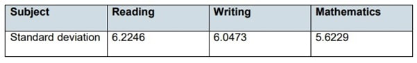
These SDs are measured in Progress Points, which the DfE suggests is a measure of the progress students make between Year 2 and Year 6.
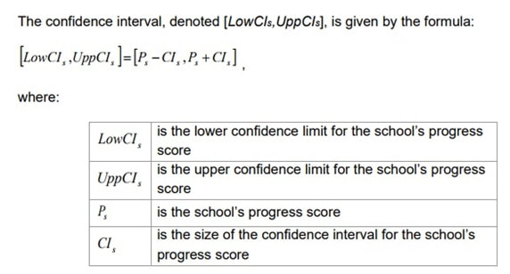
These population SDs are used in the following calculation to calculate the width of a confidence interval*, as per this formula:
These population SDs are used in the following calculation to calculate the width of a confidence interval*, as per this formula:
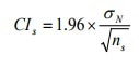
The confidence interval* is twice the value of CIs, with the datapoint in the middle of the confidence interval* which has been calculated.
To use this formula, the distribution of means of school data (which are assumed to be randomly selected from the national population) is assumed to be normal. If none of this makes sense, you might want to read Databusting for Schools, or what I wrote about the statistics being used here. If it does make sense, then ns is the size of the cohort in a school and what this calculation allows the DfE to do is to create a confidence interval* around a school’s progress score.
This means, in the DfE’s Sig calculations, that the size of your school dictates the size of the confidence interval*. Since the size of your school is, in effect, being used a divisor, the bigger your school, the smaller your confidence interval*.
This might make some kind of sense if the data meant what the DfE wants you to think it does – the bigger the cohort, the smaller the uncertainty, the smaller the confidence interval*. In effect, what it means is that your confidence interval is dictated by the size of your school’s cohort, and therefore that the likelihood of being flagged as ‘Sig+/-‘ increases as your school size increases and/or your datapoints diverge from the national mean.
A small school with datapoints half a standard deviation away from the mean is likely not to be labelled ‘Sig’, and a bigger school with data close to the national mean may well be flagged with ‘Sig’.
To show roughly how big each half of the confidence interval* is for a two-form entry, one-form entry and small primary, we will use a population SD of 6 (for illustrative purposes – it’s simply the closest whole number to the three population SDs the DfE has calculated) and primaries which have cohorts of 64, 36 and 16 students. This gives the halves of each the confidence intervals* as follows:
Two-form entry Primary – 1.96 x 6 ÷ 8 = 1.47.
One-form entry Primary – 1.96 x 6 ÷ 6 = 1.96
Small Primary – 1.96 x 6 ÷ 4 = 2.94
For 2017 primary progress scores, the halves of the confidence intervals* are simply created using the data underlying this graph:
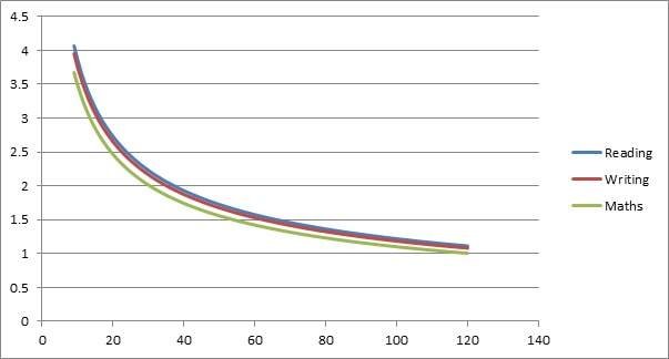
Simply read across to the number of pupils for whom you have 2017 data, and read up to find the number used to create each of the halves of the confidence intervals* the DfE allocates to your school, regardless of your data. Next, simply calculate a range for your confidence intervals*, which the DfE explains as follows:
This apes the way in which a true confidence interval as used in Null Hypothesis testing is created. At this point, were this a true confidence interval, statisticians would discuss the uncertainty involved, with the potential for potential false positives and false negatives. Statisticians would also be aware of the underlying assumptions necessary to draw limited conclusions from their calculations, none which are justified in the case of cohort data.
Nevertheless, the DFE decides whether a datapoint is to be labelled Sig + or Sig – using a simple mechanical procedure. If the confidence interval* includes zero, the datapoint is flagged as Sig. If all of the confidence interval* is greater than zero, the datapoint is flagged Sig+. If it is less than zero, the datapoint is flagged Sig-. As you will have gathered, this is a purely mechanical procedure, which means that producing Sig labels is cheap and easy (and Not Even Wrong).
So, if a school has an overall Progress Score of, say, +3.0, and has more than 20 children in Y6, you are ‘Sig +’ – yay! If a score is -3.0 and there are more than 20 children in Y6, well, tough. That’s Sig -.
Schools with similar scores with less than 20 children with the same progress scores would not be labelled ‘Sig’.
Progress scores which are more than 4 progress points from zero are nearly all labelled with Sig.
The upshot of all this is that there are lots of data points which are flagged (no matter how Not Even Wrong this is) as Sig+ and Sig-.
How many schools get data flagged Sig+ or Sig-
I would confidently predict that every school’s ASP data includes at least one datapoint which is labelled Sig+ and at least one datapoint which is labelled Sig-, simply because of the noise in the underlying data and of the mechanics of generating the labels. An unbiased die throws up unusual results on some occasions, and there is no reason not to expect this to happen in school data.
This is why so many schools see Sig+ and Sig- scattered like confetti round their DfE-generated data.
What we should do
Arguing for nuanced use of pupil progress data is a thankless task, but that doesn't mean that everyone doesn't have some responsibility for trying to improve the situation within their school or sphere of influence.
Data can flag up areas of interest, and it is much better to have some numerical information than to have none at all. That said, everyone who uses data to make decisions about schools and teaching should make sure that they understand what they are doing.
Never forget that, when looking at any DfE-originated education data, ‘Sig’, ‘Sig+’ and ‘Sig-‘ do not mean what far too many people believe they mean, and it is our duty to avoid any misdirection or confusion which the use of these terms often cause.
Ultimately, the use of ‘Sig’ needs to come to an end, and those who use DfE-originated education data to signpost lines of enquiry should either dismiss ‘Sig’ and its variants, work to remove it as a signpost, or develop different vocabulary and techniques to indicate unusual data points.
 RSS Feed
