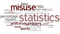
Ofsted has updated its Ofsted Schools Data Dashboard again. It released the new OSDD on April 8th, finalising the 2013 results for Key Stages 1, 2 and updating the Key Stage 4 results from 2012 to 2013. This time, the Ofsted website hasn’t made a big song and dance about it. Perhaps they have realised how hopeless it is? No, I’m afraid not. It’s back, and even more misleading, uninformative and daft than before.
As with the Key Stage 2 update in March 2014, the past has been erased and there is no way to get access to the 2012 Data Dashboard via the Ofsted site. The methodology for selecting ‘similar schools’ has been updated and the lists of ‘similar schools’ are clearly just random noise. And finally, governors have been given some ‘key questions’ which the dashboard can’t answer, even though Ofsted will expect them to have used this simplistic and not even wrong ‘tool’ to do exactly that.
No memory and no pattern
So, as with the Primary schools dashboards, the past has been erased and there is a complete lack of historical perspective. Ofsted have removed the 2012 data entirely, and just again it’s impossible to see this unless you have archived material yourself. If you are quick, you might be able to see Google’s cache of the old data. Having learned from my past mistakes (see, Ofsted, it is possible to do this), I’ve saved some random pdfs from the 2012 Dashboard for comparison.
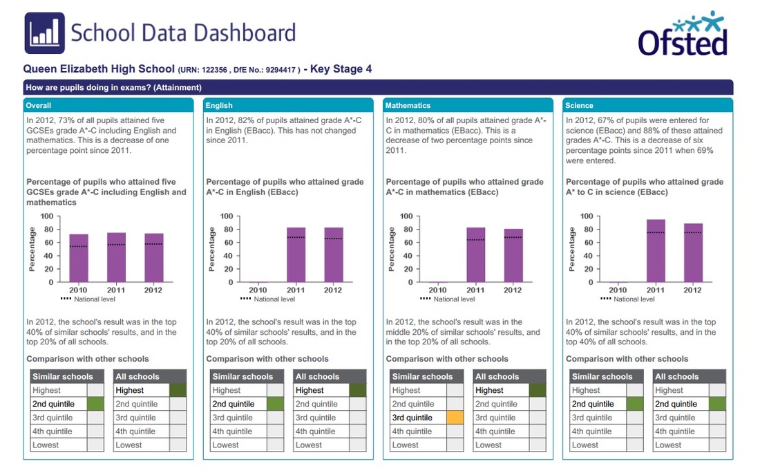
So, let’s have a look at Queen Elizabeth High School in Hexham in 2012:
As with the Key Stage 2 update in March 2014, the past has been erased and there is no way to get access to the 2012 Data Dashboard via the Ofsted site. The methodology for selecting ‘similar schools’ has been updated and the lists of ‘similar schools’ are clearly just random noise. And finally, governors have been given some ‘key questions’ which the dashboard can’t answer, even though Ofsted will expect them to have used this simplistic and not even wrong ‘tool’ to do exactly that.
No memory and no pattern
So, as with the Primary schools dashboards, the past has been erased and there is a complete lack of historical perspective. Ofsted have removed the 2012 data entirely, and just again it’s impossible to see this unless you have archived material yourself. If you are quick, you might be able to see Google’s cache of the old data. Having learned from my past mistakes (see, Ofsted, it is possible to do this), I’ve saved some random pdfs from the 2012 Dashboard for comparison.
So, let’s have a look at Queen Elizabeth High School in Hexham in 2012:
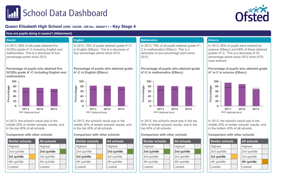
And here is 2013:
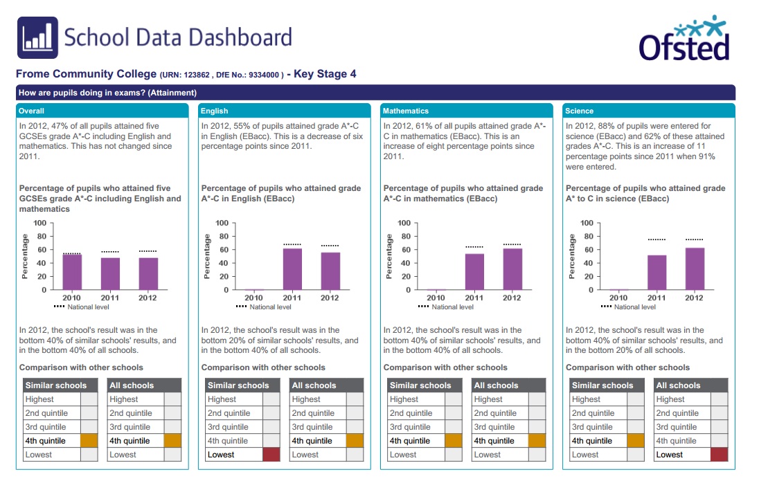
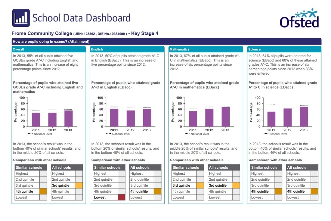
Secondly, Frome Community College in 2012:
Again, the 2013 data for comparison:
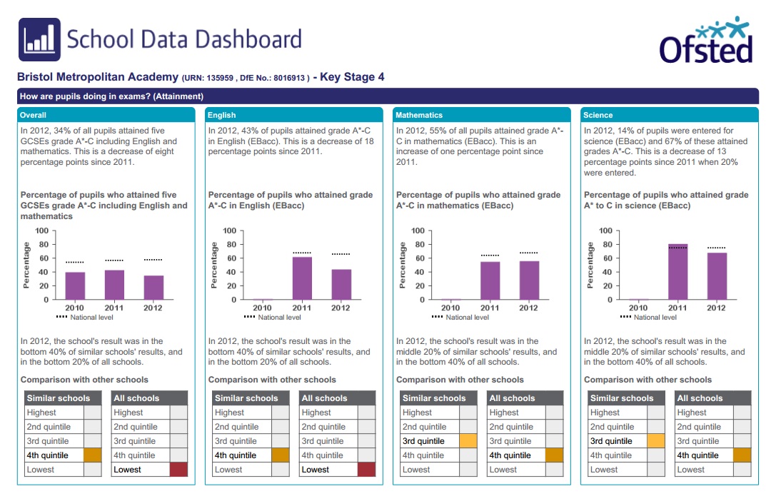
Finally, Bristol Metropolitan Academy in 2012:
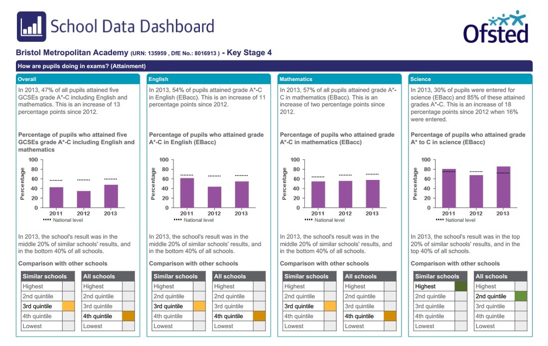
And in 2013:
As you can see, these data sets are once again effectively random, and should we ever get to see multiple years side by side, it’ll be even more clear that the data changes year on year for reasons which have absolutely nothing to do with the school in which the children are educated.
Not at all similar schools
And once again, our friend, the ‘similar schools’ which are clearly the equivalent to plucking random numbers from a hat. The 2013 OSDD uses the same may-as-well-be-random modelled data analysis as the DfS. And it now does
this for each of Five A* to C GSCEs, English, Mathematics and Science. This time, you end up with four different sets of similar schools, 54 in each, 216 schools in total.
Once again, if these schools were in any way similar, there would be an overlap between the lists of ‘similar schools’. I’d hope for a reasonable percentage; I don’t know, at least 50% or so would be good.
So, let’s take a look at the schools which are similar to Frome Community College. Ready? Here’s the list, from the 216 Similar schools:
Bishop Stopford's School, Enfield.
Er... That’s it.
Just the one, which is similar in Science and Five A*-C GCSEs. But not in Science and English. So really similar, obviously. Or not. And some consultant has been paid a fortune to tell you this kind of devastatingly useless information for every secondary school in England. Which is, whichever way you look at it, ridiculous.
Hey Governors, Ofsted thinks you’re gullible too!
The OSDD website now includes ‘key questions for governors to help generate discussion with school leaders and an
improved understanding of the school’s performance. This will also direct governors to sections of RAISEonline for more detailed data, such as expected progress by starting point.’ The ‘key questions’ are (naturally) ridiculous and
will end up misdirecting governors and adding nothing to the understanding of a school.
Let’s start with the ‘Key questions.’
1 Is this the picture that you were expecting?
2 Are standards rising in reading, writing and mathematics at Key Stage 1 and Key Stage 2?
3 Are standards rising in English, mathematics and science at Key Stage 4?
4 How is your school performing compared with other schools with a similar intake of pupils?
5 Are there differences between groups of pupils?
6 How is the pupil premium funding being used and is it making a difference?
7 What is your school doing to make sure that all pupils make at least the progress that is expected?
8 Has attendance improved over the last three years?
Of these questions, the only one which the Data Dashboard could possibly help with is the final one about attendance (8). Schools might, at a push, be held to be solely accountable for this. All of the other questions are either almost
entirely dependent on the individual children in given cohorts (2, 3, 5) or impossible to answer because of demonstrably false assumptions about what data can tell you (1, 4, 6, 7).
There are suggested supplementary questions for Governors to ask, including such gems as ‘What are the other schools in your similar group doing differently to achieve better outcomes?’, ‘If the school is in the top quintile (of ‘similar schools’), what is the school doing to maintain this?’ and ‘Are pupils making at least the progress expected year-on-year as they move through the school?’
As I said before, I pity any school which has been daft enough to waste a iota of time linking up to a random school which is ‘similar’ according to the methodology behind this misleading guff. And don’t forget that the difference between the bottom and the top quintile can be as little as 4%, so good luck hanging onto that slender difference if
your 2014 GCSE cohort is different to your 2013 one. Oh, and the expected progress measures are based on national averages which are hugely distorted by shadow education. But, you know, Governors, you wouldn’t know any
better, would you? So let’s ignore any rational analysis and take everything at face value.
But don’t worry if you are a ‘Data Confident School’
I keep reading things from Ofsted consultants who say that schools can and should use data to make a difference in their schools. It all sounds lovely until you look closely at the assumptions which are made about data, and at the way in which Ofsted, the DfS and schools mangle the data which they collect. The OSDD is merely another example of the idiocy behind much thinking about education. I'd have more time for consultants who challenged the way data is misused than those who try to present obvious nonsense in more Ofsted-friendly ways.
Back to the OSDD. It is misleading and dangerous. It offers no perspective over time. It creates random groups of ‘similar schools’. It suggests questions which Governors can’t hope to answer using its simplistic, not even wrong
‘analysis’. Ofsted expects governors and schools to use this nonsense to ‘improve standards’. Draw your own
conclusions about what this kind of data can tell you about a school and the reasons why it might be presented in this ridiculous manner.
 RSS Feed
